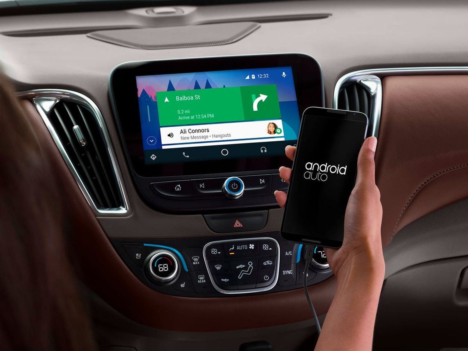
Google’s information and entertainment platform Android Auto It can be used in two different versions, which were previously designed completely differently and now no longer have the same name: now there are very significant modifications to Android Auto and Google Assistant Driving Mode, which bring new possibilities and for the first unification of the surfaces they can provide.

The last major redesign of Android Auto made its way to in-vehicle infotainment displays in the fall of 2019 and has been very little developed since then. Originally, the Google Assistant Driving Mode was supposed to start at the same time, which was supposed to replace the Android Auto app for smartphones. As you know, none of this happened and it took another two years – until today – to get the app up and running. The change should be made with the release of Android 12.
Even if both car platforms are used and controlled in the background by the same app, they don’t have much to do with each other. Despite the name, the driving mode of the Google Assistant is part of Google Maps and can currently only be used with active navigation. That may change in the next few months, but for now it’s less of a launch pad for a car and more of an advanced navigation interface.
However, the biggest visual difference lies in the alignment: while in the vast majority of cases the car’s displays are in landscape mode, driving mode can only be used in portrait mode. This ensures that the surfaces are absolutely uneven, but it seems that a solution has been found with a new tile design.
Android Auto on screen

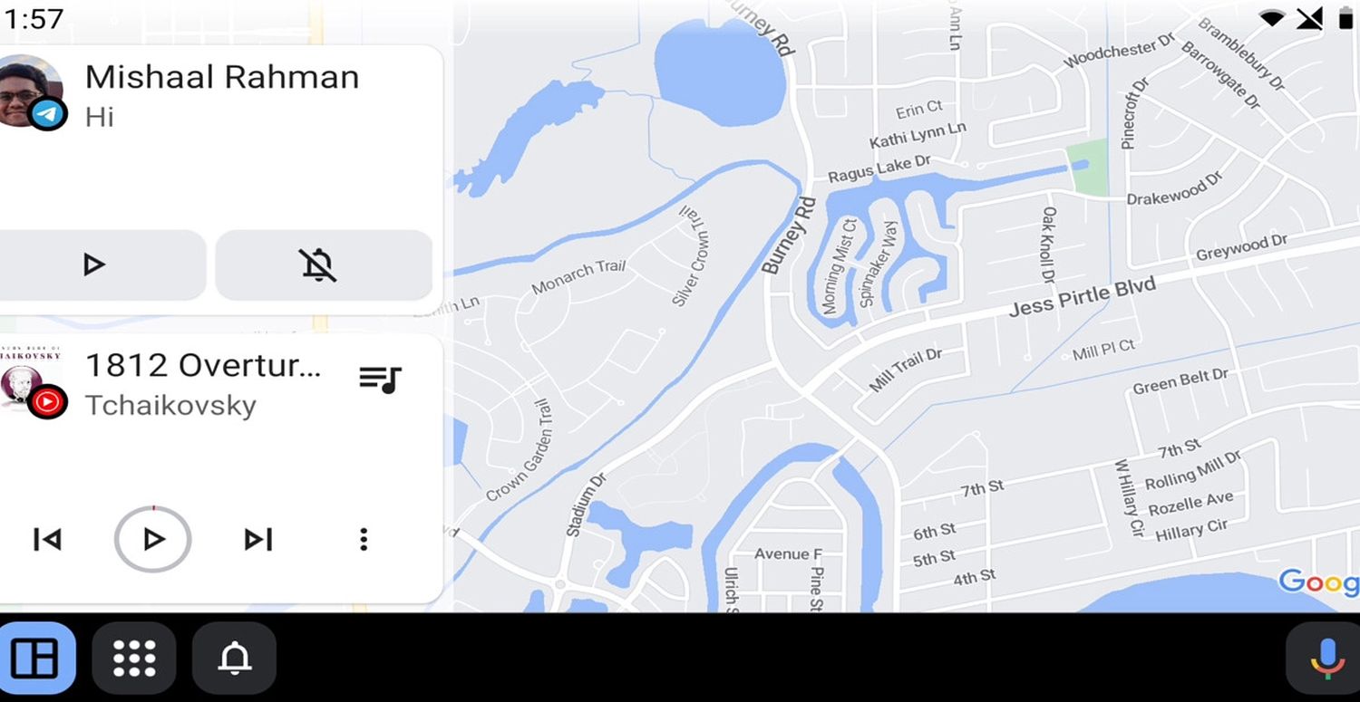
As for the Android Auto skin on infotainment screens, a new skin is currently being tested, which is far from complete, but gives interesting insight: so far, navigation has been only one of several apps, but with increasing displays there is space, more use apps in parallel . What was previously only possible with widescreen displays must be usable in all vehicles in the future.
The new design provides that in addition to the 2/3 fill navigation, two other small applications can be run. The examples show that both incoming notifications and the media player can fill these spaces. This would fill in the most important areas while driving. This has the advantage that the driver has to type less than that on the screen and may provide himself with one command or another voice command. Because everything is always at a glance.
This new division seems reasonable and should quickly become the standard once development is complete. You can find more information and screenshots In this article. However, what’s really behind it becomes visible only by looking at the new user interface of Google Assistant Driving Mode.
Google Assistant driving mode

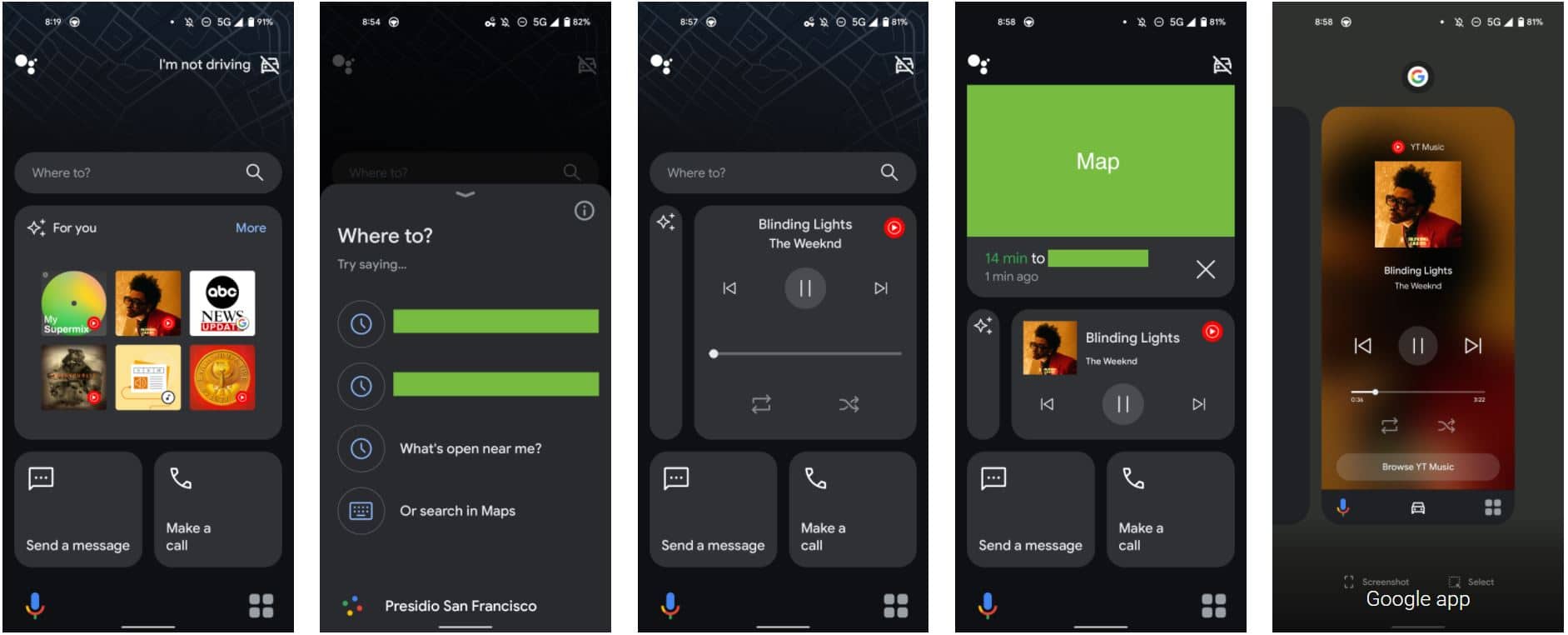
The Google Assistant Driving Mode has not yet fully launched, as users are already expecting a redesign: the new interface is based on a real tile display, which was known mainly in this model of Windows Phone at the time and a number of he-she-inspired apps. Many different applications and information that act as interactive tools and can be used interactively are listed in individual boxes. This is more of a set of widgets than a standalone interface, which in turn opens the door to more applications.

If you compare the two surfaces with each other, the similarity becomes apparent. They both want to display as much information as possible at a glance and rely on multitasking for this. Users are given more flexibility and at the same time a preliminary uniformity of separate surfaces. You probably won’t be able to do it completely, but with this update, Driving Mode finally brings the added value that users lost after switching from Android Auto to the smartphone. You can find more information and screenshots In this article.
Bridge to Android Automotive?
Interestingly, the Google Assistant Driving Mode now looks more like Android Automotive, which is supposed to be a semi-successor to Android Auto as a permanently installed operating system. On the other hand, Android Automotive in previously known models is used on a tablet in portrait format. It is entirely possible that this situation is now the bridge. The transition from Android Auto to Android Automotive will likely take several years for various reasons and for many people – depending on the manufacturers’ willingness to collaborate – it won’t even be possible.
Now we have to wait and see when the selection of apps for automated platforms will be increased. A good move has been taken with the opening of the navigation area and now it is time to allow additional classes if they allow safe operation.
» Google Maps: Street View through the founder’s garage – this is where the Google story began in 1998 (video)
» Android: With this app, you can set screen rotation as you like – portrait, landscape, and upside down
Pixel 6: Google’s original chips are here – Google is getting into the chip business in a big way (Gallery and Video)
Subscribe to the GoogleWatchBlog newsletter

“Unapologetic pop culture trailblazer. Freelance troublemaker. Food guru. Alcohol fanatic. Gamer. Explorer. Thinker.”


